Tutorial: High C data exploration
High C experiments are a collection of experimental approaches that aim at measuring the quantifying contacts between physical different genomic regions inside a cell’s nucleus. Because the experimental details differ across protocols, bioinformatic pipelines have been developed that specialize for each method and provide some statistical foundation. Nonetheless, all of them result in some kind of “contact map”, i.e. a matrix spanning the entire genome that quantifies how often region A touches region B.
This tutorial demonstrates how to use HTSeq to perform an exploratory analysis of high C reads from a BAM file. It is not a complete end-to-end solution to analyze raw reads, but it is hopefully educational to understand how to use HTSeq in a flexible and powerful way.
HTSeq is not a read aligner: the data used in this tutorial are derived from the publicly accessible example data from the package HiC-Pro, which is available here: https://zerkalo.curie.fr/partage/HiC-Pro/HiCPro_results/HiC_Pro_v2.7.9_test_data/bowtie_results/bwt2/dixon_2M/SRR400264_00_hg19.bwt2pairs.bam. The data itself was originally published by Dixon et al. (2012) and the reads were aligned using bowtie2. The BAM file we are using is unsorted, i.e. read1 and read2 of each paired-end are on subsequent lines.
Step 1: check the lay of the (genomic) land
We start by loading the BAM file and checking for chromosome names and lengths:
>>> import HTSeq
>>> bamfile = HTSeq.BAM_Reader("SRR400264_00_hg19.bwt2pairs.bam")
>>> header = bamfile.get_header_dict()
>>> chromosomes = header.references
>>> chlengths = header.lengths
chromosomes is a tuple with the chromosome names, and chlengths is a tuple with the length of each chromosome. So far so good.
Step 2: make windows along each chromosome
Although proper software such as HiC-Pro focus on the actual molecular fragments resulting from the enzymatic digestion of the genome, we are just exploring and need not be so subtle here. Instead, we make big genomic windows of equal size along all chromosomes and assign each read into a bin, to get a high-level overview of the dataset:
>>> window = 10_000_000  # 10 megabases size
>>> window_ivs = [] # list of GenomicInterval for each window
>>> for chrom, chlen in zip(chromosomes, chlengths):
...     # Count how many windows in this chromosome
...     nwins = (chlen // window) + int(bool(chlen % window))
...     # Compute the window edges
...     edges = np.arange(nwins + 1) * window
...     if chlen % window:
...         edges[-1] = chlen
...     # Create a genomic interval for each window
...     for i in range(len(edges) - 1):
...         window_iv = HTSeq.GenomicInterval(
...             chrom, edges[i], edges[i+1], '.',
...             )
...         window_ivs.append(window_iv)
For each chromosome, we make 10 Mb-wide bins that will count reads, and for each bin we create a GenomicInterval. We set the strandedness as ., i.e. unstranded: again, just exploring.
We can then proceed to create our output data structure, a matrix of integers counting how often read 1 falls into a certain bin while, simultaneously, read 2 falls into another:
>>> number_intervals = len(window_ivs)
>>> coverage = np.zeros((number_intervals, number_intervals), np.int64)
Step 3: scanning the BAM file and assign each read pair
We then parse the reads from the BAM file. Becase we want to parse both reads from each pair at the same time, we use the helper function :func:pair_SAM_alignments:
>>> bampairs = HTSeq.pair_SAM_alignments(bamfile, primary_only=True)
and the parsing itself:
>>> for n, (read1, read2) in enumerate(bampairs):
>>>     hits = [[], []]
>>>     for i, window_iv in enumerate(window_ivs):
>>>         if read1.iv.overlaps(window_iv):
>>>             hits[0].append(i)
>>>         if read2.iv.overlaps(window_iv):
>>>             hits[1].append(i)
>>>
>>>     for i1 in hits[0]:
>>>         for i2 in hits[1]:
>>>             coverage[i1, i2] += 1
>>>     if n == 1000000:
>>>         break
This is a mouthful! Let’s go over it bit by bit. First, the variable n is just helping us keep track of how many read pairs we processed. For exploration, it is often sufficient to analyze part of the data to get a sense of the situation, in this case 1 million read pairs.
Then, read1 and read2 are the two reads of each pair. We create two lists, inside hits, that check which of our GenomicInterval each read falls into. Note that a read could fall into multiple intervals in this algorithm: whether that’s appropriate is left for the reader as an exercise.
Then, we iterate over all genomic regions and actually tick the ones each read overlaps with. Finally, we add +1 to coverage for each joint window.
At this point, the heavy lifting is done, and coverage contains our exploratory contact map. All we have left to do is to plot the result.
Step 4: plotting the contact map
Data visualization is an art in itself, so the following code might look complicated if you’re not used to plotting with matplotlib. There’s nothing fancy going on, as any matplotlib user with average experience can confirm: we just try to make it a little pretty!
First, let’s plot the counts:
>>> fig, ax = plt.subplots(figsize=(7, 6))
>>> ax.matshow(
...     coverage,
...     cmap='Reds',
... )
Then, let’s add bars on the side that mark each chromosome. This snippet is just drawing a few horizontal/vertical lines around the plot, so don’t be scared:
>>> # Assign a color to each chromosome
>>> colors = sns.color_palette('husl', n_colors=len(chromosomes))
>>> # Record which chromosome each interval is in
>>> tmp = np.array([iv.chrom for iv in window_ivs])
>>> # Record the position of chromosome boundaries
>>> chrom_boundaries = []
>>> for chrom in chromosomes:
...     tmp2 = (tmp == chrom).nonzero()[0]
...     win_start, win_end = tmp2[0], tmp2[-1]
...     win_mid = 0.5 * (win_start + win_end)
...     # Add a text on the left with the chromosome name
...     ax.text(
...         -coverage.shape[0] * 0.04, win_mid, chrom,
...         ha='right', va='center',
...     )
...     # Add a vertical line on the left to mark the chromosome
...     ax.plot(
...         [-coverage.shape[0] * 0.03] * 2, [win_start - 0.5, win_end + 0.5],
...         color=colors[chromosomes.index(chrom)],
...         lw=5,
...         clip_on=False,
...     )
...     chrom_boundaries.append(win_start - 0.5)
...     # Add a horizontal line on the left to mark the chromosome boundary
...     ax.plot(
...         [0, -coverage.shape[0] * 0.05], [win_start - 0.5] * 2,
...         color='k', lw=1, clip_on=False,
...     )
...     # The last chromosome needs a boundary at the end as well
...     if chrom == chromosomes[-1]:
...         chrom_boundaries.append(win_end + 0.5)
...         ax.plot(
...             [0, -coverage.shape[0] * 0.05], [win_end + 0.5] * 2,
...             color='k', lw=1, clip_on=False,
...         )
>>> ax.set_xlim(left=0)
>>> # Set a grid based on chromosome boundaries, which looks tidy
>>> ax.set_xticks(chrom_boundaries)
>>> ax.set_yticks(chrom_boundaries)
>>> ax.set_xticklabels([])
>>> ax.set_yticklabels([])
>>> ax.grid(True)
>>> # Help the figure look tidy in general
>>> fig.tight_layout()
The resulting plot is shown below. White bins have no read pairs, while orange and finally red have higher and higher number of contacts:
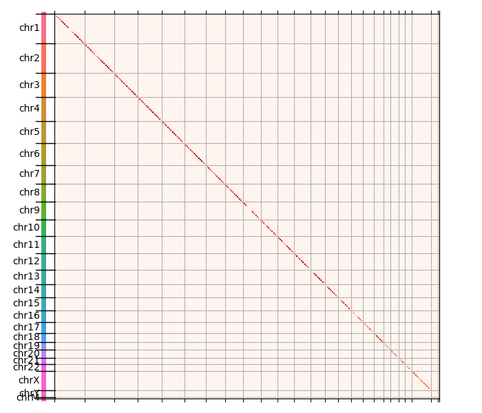
You can see that the diagonal is pretty much the only visible thing, which means that most contacts are between close genomic regions - makes sense.
The natural structure of the data appears if we remove the diagonal and replot:
>>> covnd = coverage.copy()
>>> covnd[np.arange(covnd.shape[0]), np.arange(covnd.shape[0])] = 0
>>>
>>> fig, ax = plt.subplots(figsize=(7, 6))
>>> ax.matshow(
...     covnd,
...     cmap='Reds',
... )
(The rest of the snippet is the same.)
We get the following image:
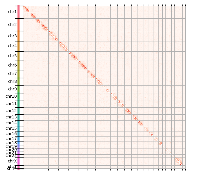
This is interesting, we start seeing faint halos around each diagonal. In order to visualize the full dynamic range of the counts, we perform a pseudocounted log transformation:
>>> fig, ax = plt.subplots(figsize=(7, 6))
>>> ax.matshow(
...     np.log10(1 + covnd),
...     cmap='Reds',
... )
(As you suspect, the rest of the snippet isn’t changing.)
That gives us the following plot:
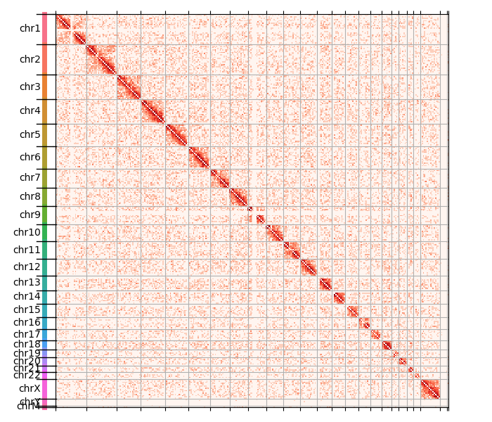
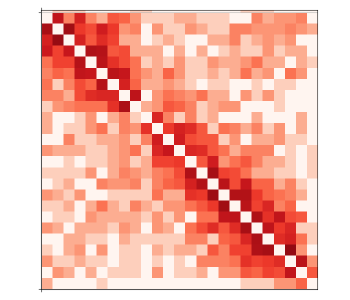
The data is somewhat noisy, which is expected given this whole exercise has no quality control of any sort! Now the chromosome structure is quite clear: intrachromosomal contacts are a lot more common than contacts between chromosomes. Moreover, several chromosomes are split in two arms, just like you would expect given they actually have two arms with the centromere in the middle. We can zoom in to see that in more detail, e.g. about chromosome 2:
This concludes the tutorial. Hopefully you found it useful to learn a little how to use HTSeq to explore some interesting high C data.